微信小程序动画之消息框弹出,供大家参考,具体内容如下
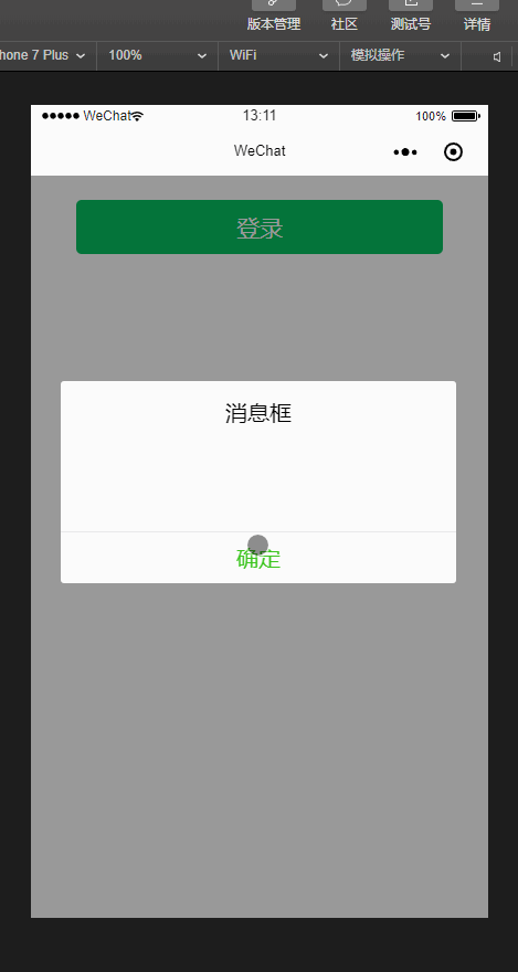
上图
js:
Page({
 data: {
  showModalStatus: false
 },
 powerDrawer: function(e) {
  var currentStatu = e.currentTarget.dataset.statu;
  this.util(currentStatu)
 },
 util: function(currentStatu) {
  /* 动画部分 */
  // 第1步:创建动画实例
  var animation = wx.createAnimation({
   duration: 300, //动画时长
   timingFunction: "linear", //线性
   delay: 0 //0则不延迟
  });

  // 第2步:这个动画实例赋给当前的动画实例
  this.animation = animation;

  // 第3步:执行第一组动画
  animation.opacity(0).rotateY(100).step();

  // 第4步:导出动画对象赋给数据对象储存
  this.setData({
   animationData: animation.export()
  })

  // 第5步:设置定时器到指定时候后,执行第二组动画
  setTimeout(function() {
   // 执行第二组动画
   animation.opacity(1).rotateY(0).step();
   // 给数据对象储存的第一组动画,更替为执行完第二组动画的动画对象
   this.setData({
    animationData: animation
   })

   //关闭
   if (currentStatu == "close") {
    this.setData({
     showModalStatus: false
    });
   }
  }.bind(this), 200)

  // 显示
  if (currentStatu == "open") {
   this.setData({
    showModalStatus: true
   });
  }
 }

})
wxml:
登录


 消息框


 确定
wxss:
/*button*/

.btn {
 width: 80%;
 padding: 20rpx 0;
 border-radius: 10rpx;
 text-align: center;
 margin: 40rpx 10%;
 background: #07c160;
 color: #fff;
}

/*mask*/

.drawer_screen {
 width: 100%;
 height: 100%;
 position: fixed;
 top: 0;
 left: 0;
 z-index: 1000;
 background: #000;
 opacity: 0.4;
 overflow: hidden;
}

/*content*/

.drawer_box {
 width: 650rpx;
 overflow: hidden;
 position: fixed;
 top: 50%;
 left: 0;
 z-index: 1001;
 background: #fafafa;
 margin: -150px 50rpx 0 50rpx;
 border-radius: 3px;
}

.drawer_title {
 padding: 15px;
 font: 20px "microsoft yahei";
 text-align: center;
}

.text {
 font: 20px "microsoft yahei";
 text-align: center;
}

.drawer_content {
 height: 80px;
 overflow-y: scroll; /*超出父盒子高度可滚动*/
}

.btn_ok {
 padding: 10px;
 font: 20px "microsoft yahei";
 text-align: center;
 border-top: 1px solid #e8e8ea;
 color: #3cc51f;
}

.bottom {
 padding-bottom: 20px;
}

.bubble {
 position: relative;
 overflow: hidden;
}

.bubble:after {
 content: "";
 background: #999;
 position: absolute;
 width: 750rpx;
 height: 750rpx;
 left: calc(50% - 375rpx);
 top: calc(50% - 375rpx);
 opacity: 0;
 margin: auto;
 border-radius: 50%;
 transform: scale(1);
 transition: all 0.4s ease-in-out;
}

.bubble:active:after {
 transform: scale(0);
 opacity: 1;
 transition: 0s;
}
以上就是本文的全部内容,希望对大家的学习有所帮助,也希望大家多多支持脚本之家。
 登录查看全部
参与评论
手机查看
返回顶部